Reassert the strength and excellence of Papillon at the deli counter.
Papillon is a house of excellence, built on a unique, century-old expertise. Yet its visual expression had become fragmented over time.
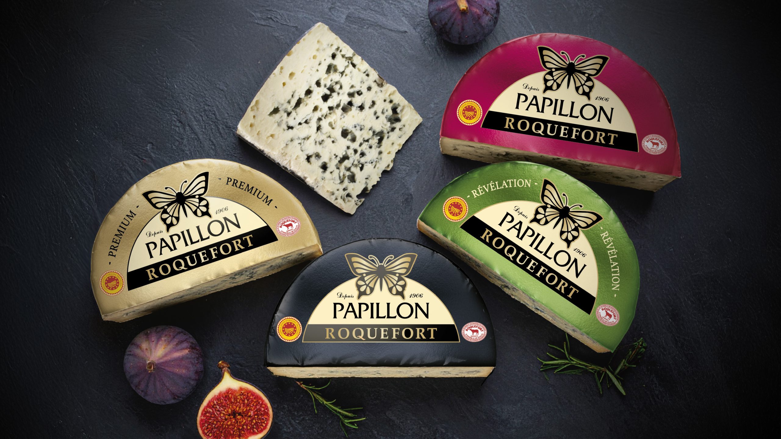
ZAKKA restructured the packaging expression of Roquefort Papillon to restore strength and elevate the brand’s stature.
The agency put an end to graphic dispersion by developing a clear, coherent, and premium design system, designed to enhance perceived value at shelf.
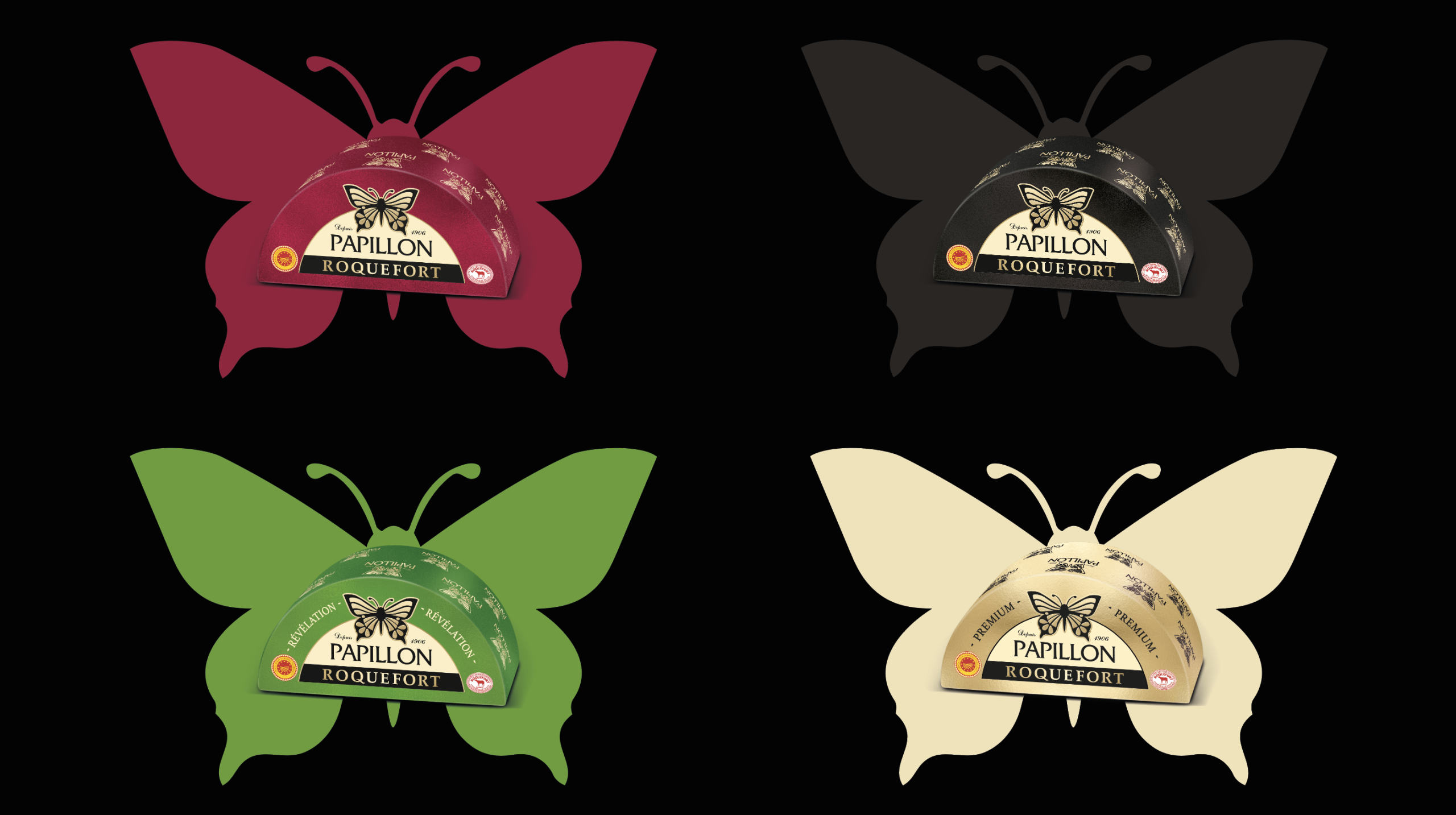
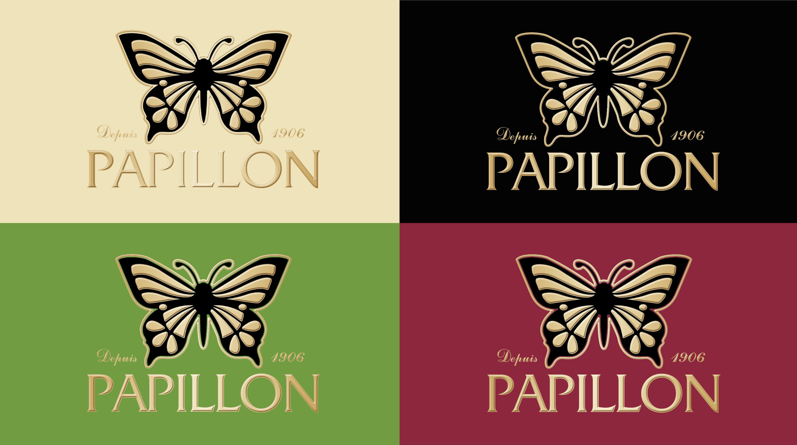
The unification of the identity around a gold Papillon logo becomes the central anchor of the packaging—a strong, instantly recognizable sign that places the brand at the heart of the expression and reinforces its premium positioning.
Historic codes are embraced and carefully refined. Simplified and hierarchized, they reveal the authenticity of Roquefort Papillon, the nobility of its recipes, and the legitimacy of an iconic brand at the deli counter.